A logo isn’t just your brand’s name in a pretty font with a cool graphic, there’s an actual science behind it. A logo is the face of your brand/business and is by far the most important branding element you’ll bring to life. But where does one begin? Designing a logo can be exciting as well as equally daunting but never fear, Expand a Sign has the ultimate guide to designing the perfect logo for your brand. Through our extensive research, we’ve created this guide to help you define your brand’s identity and how to incorporate it into your design.
So without further ado, let’s start this amazing brand journey.
Why do you need a logo?
Your logo is a customer’s first emotional connection with your brand and it’s this design asset that is most closely associated with your business. Your logo is the single most important design element that will appear on all your marketing and advertising mediums. From your products and your website, to your corporate stationery and various forms of branding, so it’s essential to ensure that your logo not only represents your brand correctly but helps you stand out from your competition.
Top Tip: Consistency is key! Consistency builds recognition, trust and authenticity. It’s important to create a logo that represents your brand properly and this translates to all Marketing and Advertising mediums.
Define your brand’s identity
Your brand’s identity communicates to your customers, what makes you so unique and who/what your brand is all about. It’s essentially your brand’s core personality and it’s essential for this personality to be translated into your logo design.
How do you determine your brand’s identity? Well there’s no real copy and paste method but here are 3 simple questions you can ask yourself, to help define your brand’s identity.
- Why did you start your business?
- What are your brand’s core values?
- What makes your brand unique?
Once you’ve established your brand’s identity, it’s much easier making design choices that will compliment this.
Top Tip: Don’t overcomplicate things. Customers see through all the fancy jargon and over-engineered copy. Be the type of brand you would want to do business with. Keep things simple, real and authentic.
Get inspiration

This is possibly the hardest part of the journey – finding inspiration for your design. If you’re anything like me (OCD), you’ll find it difficult to narrow your choices down as it’s always “one more page” on Google, fearing that you may miss the perfect design inspo on the next page. Nevertheless, it’s all part of the design journey.
Conceptual vs Visual

If you’re a conceptual and analytical individual, the best advice we can offer here is to brainstorm ideas with your team, friends and family. Brainstorms offer a fresh approach from different perspectives, and usually result in just what you need to pin down the look and feel you’re trying to achieve.
Top Tip: Brainstorming is about fleshing out the good and bad ideas. Even bad ideas can spark a conversation which leads to a great idea.
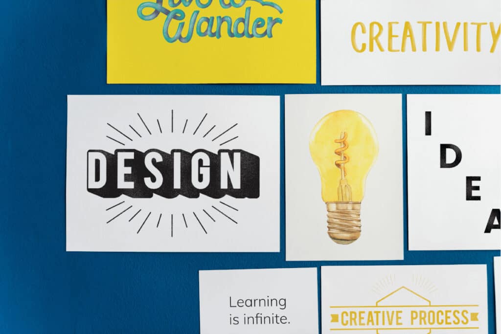
Creative individuals, prefer visuals for inspiration. Put together a mood board and hang it up in an area that you frequent and in your face because inspiration can hit anytime (mine is usually at 2am in the morning). You’ll soon start to see your mood board taking shape and reflecting the style and design features you are gravitating towards in no time.
Top Tip: Just remember when looking for inspiration, to keep your brand’s identity front of mind. Eg: If you’re a vintage brand, don’t look at modern designs for inspiration.
Check out your competition

Some people will argue that this approach lacks originality however, even innovators look to their competition for inspiration. Checking out your competition is a great way to help determine what design elements are already being used, what works and what doesn’t. This research also helps you define the differences between you and your competition, and how you can emphasise this in your logo design.
Top Tip: If all your competitors are using monochrome logos, opt for something colourful. You want to find elements to help you stand out from the crowd and attract attention, not blend in.
Your design style
Now is where the fun begins… Time to take your inspiration and ideas, and translate them into a design that will represent the essence of your brand. There are a lot of elements that come into play here which can be overwhelming at first, so it’s important to isolate each component individually as opposed to attacking the design as a whole. A logo is essentially broken up into four components. Icon (shapes/graphics), Colour, Typography and Tagline.
Top Tip: There’s no “one shoe fits all” strategy when it comes to the design aesthetic for your brand, so use the tips discussed previously to help guide you.
When it comes to the design aesthetics of your logo, there are a ton of options to choose from, so we’ve done some homework and narrowed them down to the most popular choices.

Handmade: This style conveys a message of individualism and authenticity. A style typically adopted by brands that want to illustrate handmade quality.
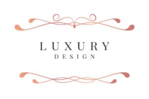
Classic: This style is timeless and conveys a message of class and sophistication. There are no bells and whistles with this design, just simple elegance.

Vintage/Retro: This style, contrary to its’ description, is quite trendy and has been for some time. Simply because we all associate something or some experience back to our childhood. Vintage/Retro logos play on these past experiences by evoking feelings of nostalgia. Brands that adopt this style, appear authentic and trustworthy
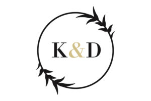
Minimalist: This clean style has a fresh and modern message. Brands that adopt this style want their customers to know that they’re current and cool. This style usually adopts the use of white/negative space, geometric patterns and gradients, as well as simple lines with a far more adventurous colour palette than the previous styles.

Fun/Quirky: This style is whimsical and colourful, and typically paired with hand drawn illustrations. Usually adopted by brands that want to show their friendly and positive vibe, this style is fun and geared towards the consumer that is young at heart.
Choosing a logo type
Now that you’ve chosen your style, it’s now time to choose your logo type. You’re probably asking yourself. “With the millions of logos and brands out there, how is it possible to choose a logo type”? Well, as diverse as all these logos are, they all follow the same parameters found in these 7 logo types. Let’s take a look at some famous examples.
Top Tip: Shapes play a massive role in the psychology of logos. Round shapes evoke feelings of community and unity, whilst sharper straight-edged shapes are associated with efficiency and stability.
Lettermark: Brands with long names simplify their logo by utilising initials as it’s easier for customers to say and remember. Unfortunately, this logo type isn’t great for expressing what your brand is about.
Wordmark: These logos are all about typography and capture the personality and essence of your brand.

Pictorial Mark: These are graphic-based logos usually for brands so established, that the brand icon alone is instantly recognisable.
Abstract Mark: This design is very similar to pictorial marks but instead of utilising a recognisable image for the icon, an abstract or geometric design is used. This design allows you to be more creative and condense your business into a symbol that is truly unique.
Mascot Logo: Simply put, these are ambassadors for your brand. They are a fun way of giving your brand a personality and perfect for brands that want to appeal to children and families.
Combination Mark: This type of logo is the most popular choice due to its’ versatility. Customers are able to associate both elements with your brand and over time, you may be able to rely exclusively on your brand icon when advertising.
Emblem Logo: These logo types have a traditional look and come in the form of badges, seals or crests.
Choosing colours
Now, this is not as simple as it sounds. There’s a psychology behind colours and the emotional connection we associate with them. Here’s what research has shown each colour to represent:
- Red: Red represents passion, excitement and anger – ideal choice for brands that are modern, loud, youthful or playful. This colour has also been shown to stimulate hunger, which is why a lot of restaurants and fast food outlets adopt red.
- Orange: Orange is for brands that want to stand out from the crowd. Orange isn’t as intense as red but is still playful and energetic. If you feel that your brand is unique, then orange is the colour for you.
- Yellow: Yellow is seen to be friendly and possess a youthful energy. Yellow appears to be less mature than the other colours, so if you’re a corporate type brand then this colour is definitely not for you.
- Green: Green is the most versatile colour out there when it comes to brands. Green is seen as growth or new life but also as death by many cultures. A popular colour adopted by eco-warriors and organic brands all over the world.
- Blue: Blue is the most popular and common choice by brands. Blue symbolises maturity, classic confidence and trustworthiness. Due to its’ popularity, If you choose blue as a colour, you will need to opt for a creative design in order to stand out. Lighter shades of blue can appeal to more playful brands.
- Purple: Purple is a sign of luxury and wisdom. This is a great colour for brands that are high-class and pioneers in their industry. Purple is also a little feminine, so not recommended for male brands.
- Pink: Pink is not just for girls anymore. Pink offers a versatility on the colour wheel. With light pastel pinks to neons, offering brands a modern and youthful look.
- Brown: When you think of brown, rugged, natural, handmade and outdoorsy comes to mind. This colour is perfect for vintage and masculine brands.
- Black: This sleek, modern and luxurious colour, offers a sense of mystery and exclusiveness. The ideal colour for brands wanting to keep it simple.
- White: White is clean, modern and minimalistic and can work with any other colour. Whether in the foreground where the background colour dominates or as an accent colour, white is ideal for any brand.
- Grey: Grey is not just black and white. Grey represents maturity and class and is the ideal colour for brands wanting a classic feel.
Top Tip: You don’t have to stick with a monochrome logo, using just one colour. This is just a guide to colour psychology. We encourage brands to combine several colours to tell a complete brand story.
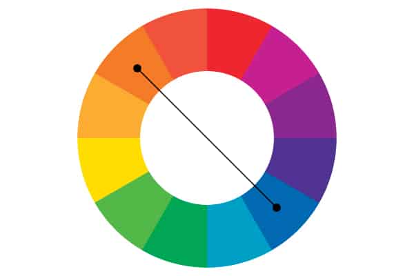
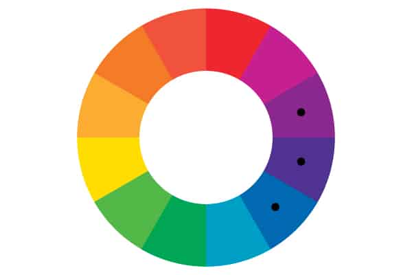
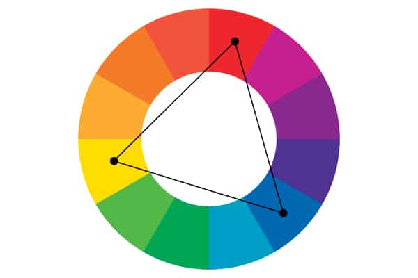
To help guide you, check out the below colour wheel to see which colours work well with each other.
- Complementary: These colours lie directly across from each other on the wheel. They bring out the best in each other and create a very bold and dynamic look.
- Analogous: These colours are close to each other on the wheel. If you want your logo to have a sense of harmony, these will work well together as there’s very little contrast.
- Triadic: These colours draw from three(tri) equal sections on the wheel. Choose these colours for a bold, stimulating effect.
Choosing typography
Picking a font is possibly the hardest part due to the sheer amount of options available to you. The challenge is to find a font that not only complements and completes your logo, but also give it a unique look.
Here’s a breakdown on the different types of fonts available. The specific font you choose, all goes down to the look n feel you’re trying to achieve.
Most typefaces can be classified into one of four basic groups: serifs, san serifs, scripts and decorative styles. These can be further broken down into sub-categories. Here are just a few:
Serif
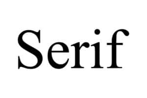
Serif fonts have a classic and high-end look but can also appear old-fashioned. They’re the ones with the little feet at the end of each letter.
- Old Style
- Transitional
- Neoclassical & Didone
- Slab
- Clarendon
- Glyphic
Sans Serif

Sans-serif fonts reflect a more modern, clean look. They appear very sleek and simple.
- Grotesque
- Square
- Humanistic
- Geometric
Script
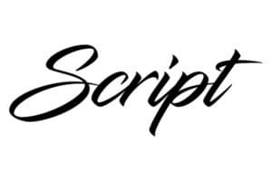
Script fonts are elegant and give your logo a more individualistic look.
- Formal
- Casual
- Calligraphic
- Blackletter & Lombardic
Decorative
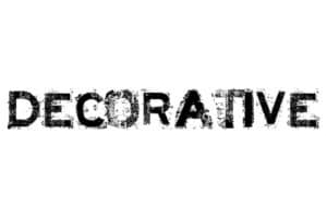
Display fonts stylised and decorative fonts that really catch the eye.
- Grunge
- Psychedelic
- Graffiti
Let’s start designing
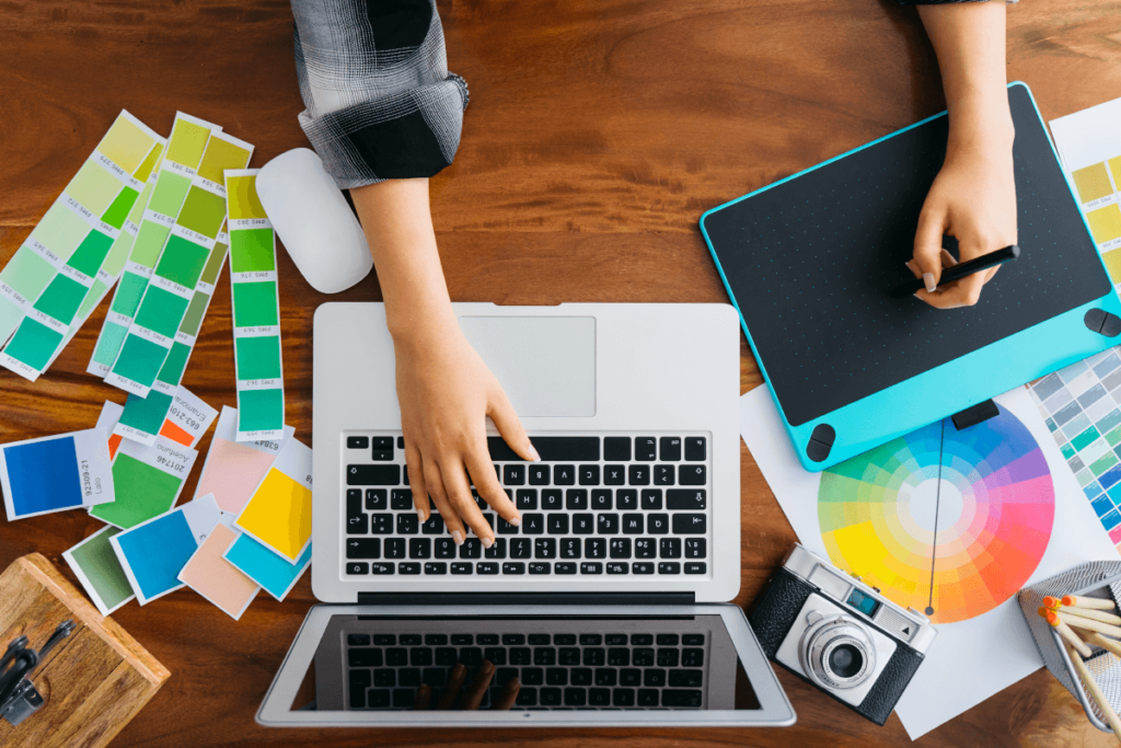
Now your brand’s journey really starts taking shape. There are many ways to get a logo, so you should consider which one suits you best and your budget. If you have an in-house design team, you should consider a logo design competition, otherwise we recommend an agency. Agencies can be pricey, so shop around and be sure to check out their portfolios before committing.
Whichever option you go with, be sure to provide a clear and concise brief. All the work you’ve done before this point will be all for nothing, and will be greeted with constant back and forth changes. With that being said, try stay open to suggestions as designers have the industry experience – so rather collaborate with your designer as opposed to telling them what to do.
Top Tips: Don’t be too generic if you want to stand out. Don’t overcomplicate the design – keep things clean and simple. Make sure the design is timeless rather than overly trendy.
Now that you’ve created the foundation for your brand, it’s now time to translate this into a corporate identity which we’ll be discussing in our next blog.
What more can we say, your brand is now ready to go forth and be awesome.
Research Sources: 99 Designs, Fonts.com and Shutterstock

