A logo is the face of your brand/business and is by far the most important branding element you’ll bring to life but there comes a time when every logo needs to evolve – even the biggest brands in the world have had to do it.
There was a time years ago, when all it took to be successful in business was to make good quality products. Fast forward around 70 years and consumers are more likely to align themselves with brands and the street cred they can offer more than the product itself – putting more emphasis on ensuring that your logo is on point with your target audience more than your competition.
We’re by no means saying that quality has taken a back-seat but if you can make a product that not only ticks the quality box but a brand that looks great too, you’re on your way to the bank.
Now, what better way to evaluate the effectiveness of a brand’s logo than to examine how they’ve evolved over the years? We have taken 5 of the most iconic brands as well as our own, and researched how their logos have evolved. Some brands have undergone some drastic changes and others a little more subtle.
Adidas
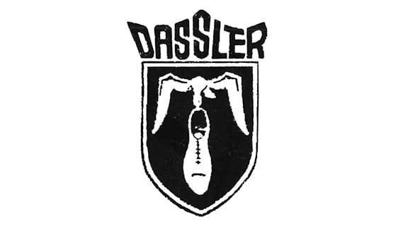
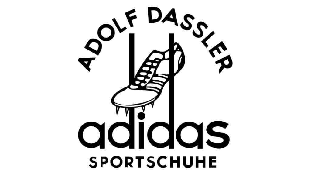
Adidas has long been famous for its’ three stripes logo however, they weren’t the first company to use this design. The original owner of the logo was Karhu Sports but they were hit hard by WWII and as a result, short on capital. The owner agreed to sell Adidas the trademark to their logo for €1,600 and two bottles of whiskey and the rest is history.
Even before Adidas purchased the trefoil logo from Karhu Sports, they were adding three bars to all of their products and they referred to themselves as the “three stripe company”.
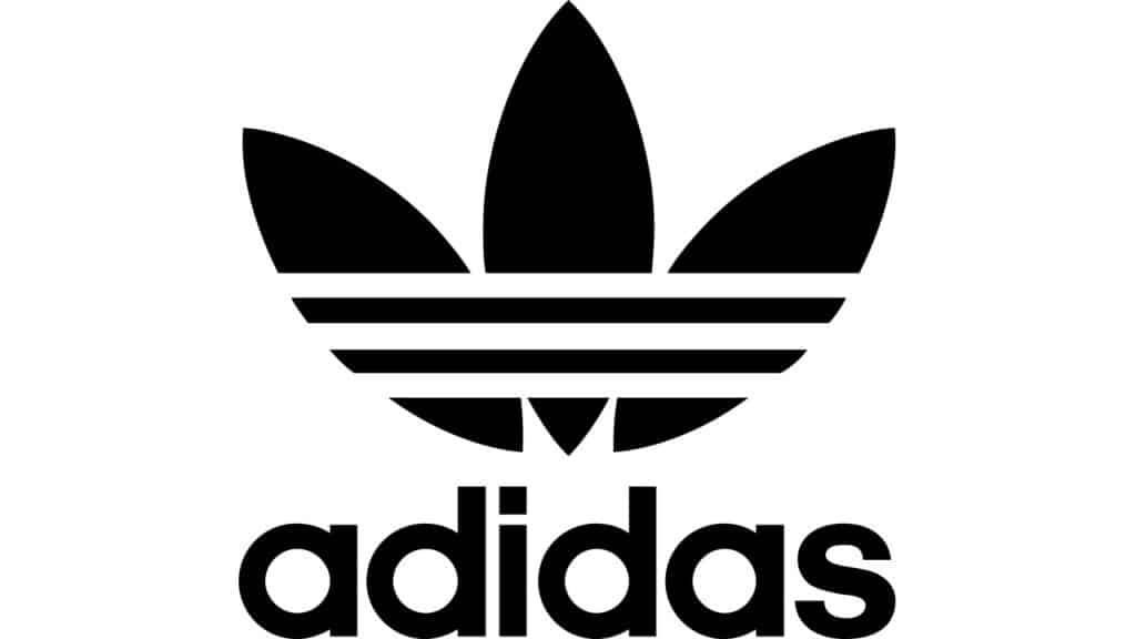
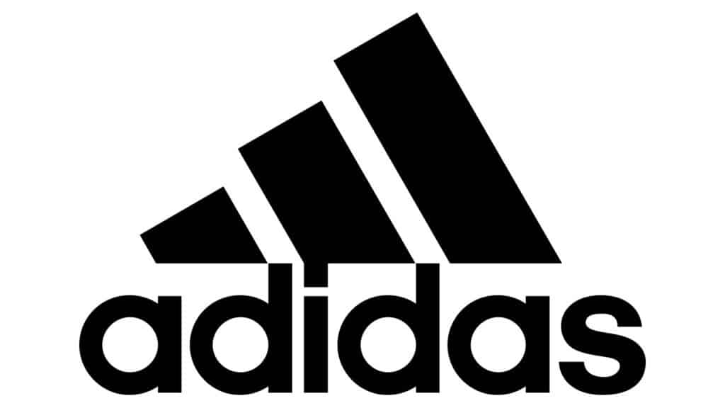
In 1971, Adidas unveiled their three-stripe logo in a form that resembled a leaf they called the “trefoil”. This version was later replaced by the current logo which is shaped like a triangle, though the trefoil logo can still be found on the Adidas originals product range.
Apple
The first Apple logo was designed by Steve Jobs and Ronald Wayne in 1976. It shows Isaac Newton sitting under an apple tree. Inscribed into the logo: “Newton… a mind forever voyaging through strange seas of thought” with ‘Apple Computer Co.’ on a ribbon banner.
This logo only lasted a year and was then replaced by the logo we all know today – the iconic apple. Since then, the logo has undergone some subtle changes in colour palette but has always kept the design consistent.
Shell
Over Shell’s 100+ year history, their logo has undergone some serious changes – from a rather true-to-life depiction of a seashell to a modern stylized emblem.
A logo so recognisable with its’ distinctive colours, it doesn’t even need to use the word Shell in their advertising. This is the ultimate goal for any brand.
Pepsi
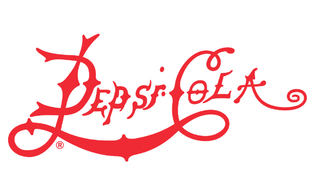
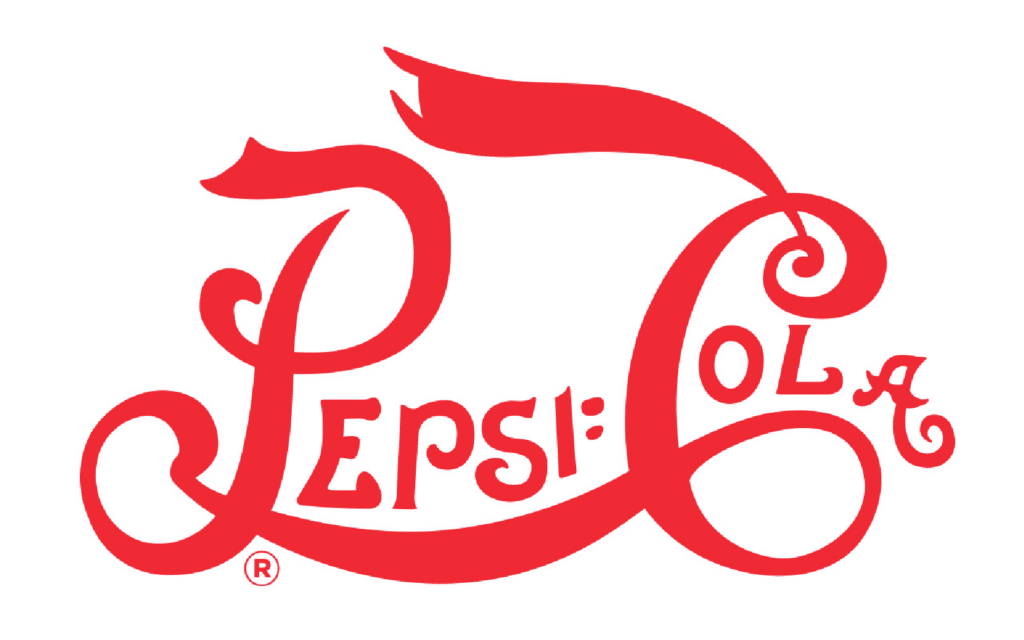
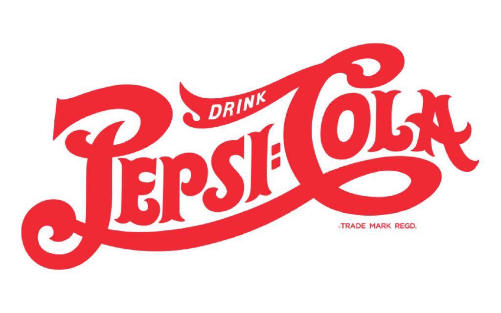
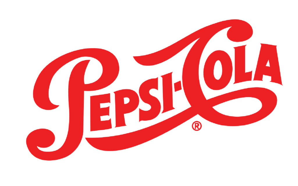
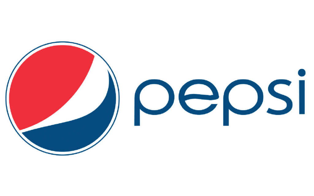
This is possibly one of the biggest evolutions of a logo.
Pepsi was originally created by Caleb Bradham in 1898 out of his house and sold under the name “Brad’s Drink”. Seeking a broader audience, he changed the name to Pepsi-Cola. He did this to identify with two important ingredients in the drink, Pepsin and kola nuts – the Pepsi brand was born.
In 1940, the CEO of Pepsi had the idea to create a logo on the bottle cap and this started a tradition that lasted for decades. The use of the iconic red, white and blue was also introduced to show support for the United States’ troops fighting in the war and to this day, the colour scheme is the same.
VW
Volkswagen was first founded in 1937 as part of the German initiative to provide citizens with affordable automobiles. Adolf Hitler came up with the idea in support of the move to build a superhighway known as Autobahn.
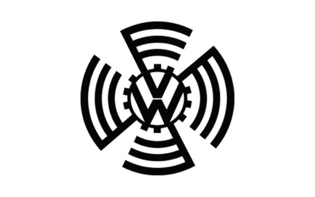
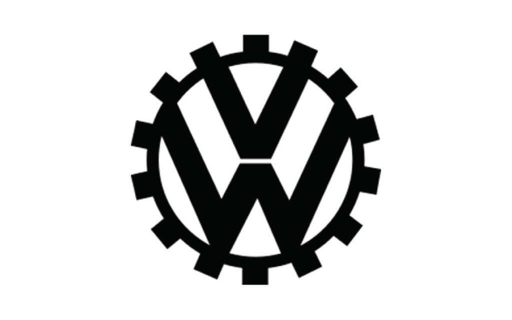
The company’s first logo comprised the VW initials within a stylised cogwheel that was surrounded by swastika wings.
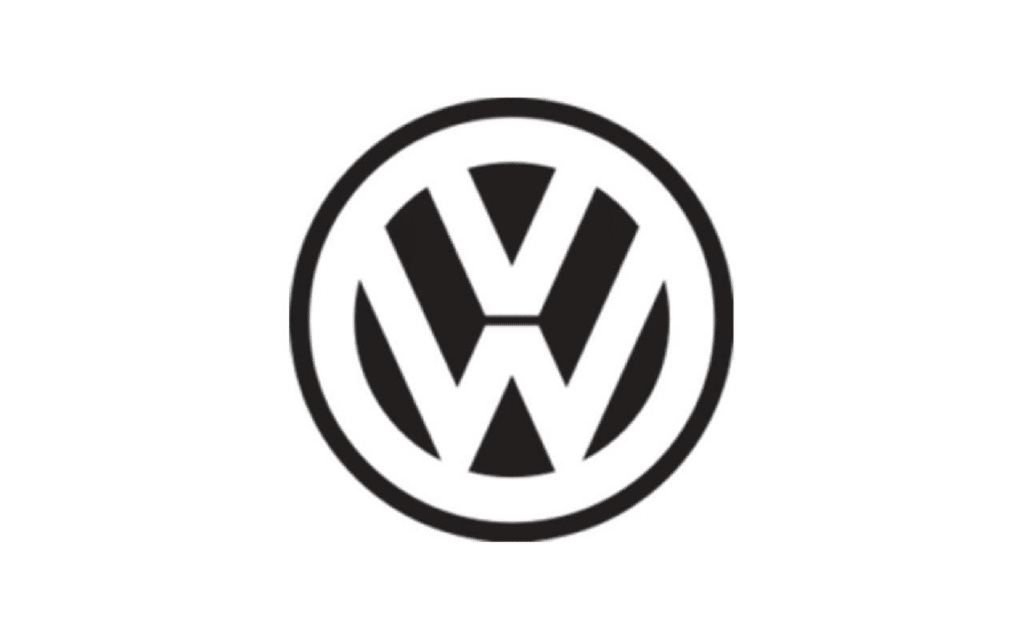
The logo saw a major evolution in 1945, taking on a simpler, more circular design. Various adaptations of this logo, with different colour and style variations followed over the next few years until VW made a major change to its logo once again.
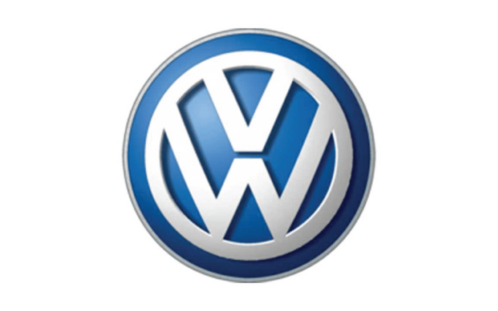
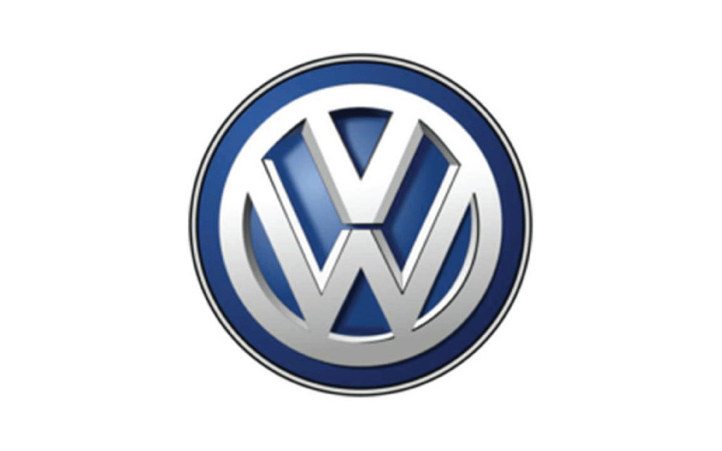
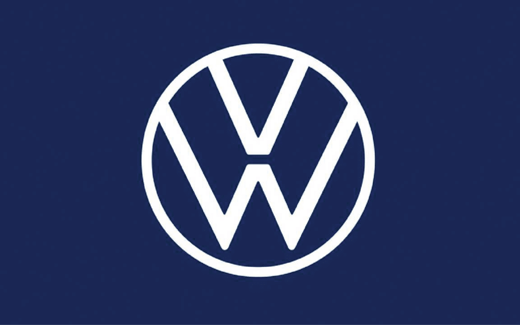
In the year 2000, VW adopted a three-dimensional logo with realistic and shaded colours, further enhancing the depth of the shape in its’ 2012 redesign. This version of the logo is present on most vehicles today, which has now been replaced by the darker blues and simpler layout of the 2019 logo which will be launched its ID.3 electric hatchback
The new logo is the vanguard of a new brand image for VW that’s younger, digital and modern.
Now, we couldn’t allow the big guns to have all the glory, so we’re sharing our brand evolution with you too.
Check out one of our earlier blogs on our RE-BRAND.
If you’ve got a logo evolution story to share with us, we’d love to hear it. Hit us up on social media.

